
As I mentioned in my previous post, I enjoyed the movie enough that I want to explore Edgar Rice Burroughs' Barsoom universe further, which obviously means jumping into the original novels. The problem is that there's so many different versions of the books that I really don't know where to start. I was tempted by Disney's new omnibus editions, but as I said before they've inexplicably cut Burroughs' forewords from each story, which apparently are quite important, so that rules them out; I mean, it would be like going to Pizza Express and not ordering dough balls for a starter - i.e. WRONG and BAD.
 |
| Lovely looking book; missing some text, apparently. |
Ultimately I settled for this edition:
 |
| Yes, the cover uses one of those woeful posters I ranted about in my last post. |
Before settling on this version I looked at a few other copies too. Basically, because the John Carter series is out of copyright various publishers have released their own version, and while I know they say you should never judge a book by its cover I'll let you into a little secret: I DO. ALWAYS. I hate - and I mean *HATE* - shitty looking book covers.
Like these.
 |
| Actually, this one is sort of OK in a pulpy kind of way. Not 100% my cup of tea, but I could live with it if push came to shove. |
 |
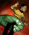
| This, in contrast, is just HIDEOUS. |
 |
| I actually had this one in my hand in Waterstones in Chiswick the other day but couldn't bring myself to buy it based purely on the horrible cover. I am such a snob. |
Anyway, I got to thinking, as I very occasionally do, and that led to a realisation that I should, just for shits and giggles, put my money where my mouth is (not that this is actually costing me anything) and have a bash at designing my own covers for the John Carter series. The thought stuck with me for a few days, until today when I had a little bit of time to kill and caved into the notion.
The idea behind this is pretty much twofold:
1. Because I think someone somewhere should've seized the idea of running out some really beautiful versions of these books to cater to people like me who discovered the Barsoom series as a result of the movie (I refuse to believe I'm the only one).
2. That you can do something clean, contemporary and eye-catching that would really stand out on a bookstore shelf and actually sell a few copies.
Now, let's not get carried away here - remember, what follows were literally done in about an hour and a half and are by no means perfect, but I think they give a general idea of what I mean. I'm imagining a nice compact hardcover edition; big hardbacks get on my nerves, but I've always liked chunky little ones - they seem a bit different, somewhat unusual, and collectable, which is important when you're dealing with a series of 11 books. Also, don't get it into your mind that I was throwing my little-used artistic talents into play here - I certainly wasn't going to whip out some oil paints and throw together a John Carter portrait. No, instead the ideas I had were based solely on typography rather than an image, because I think you can do some lovely striking things with words alone.
My first idea was basically a massive rip-off of a hardcover edition I've got of the Dave Eggers novel You Shall Know Our Velocity, which I was drawn to several years ago because the story actually starts on the front cover:
 |
| Look at that - the story starts on the front! CRAZY! But really quite cool. |
I've always liked the grey and black colours on that cover, so my first thought for my John Carter was something like that with the name of the book literally plastered across the cover in, if you'll excuse my French, massive fuck-off letters.
Like this:
 |
| Leng edition, version 01 |
(ooo, bitch)
Here's another go:
 |
| Leng edition, version 02 |
I'm not totally sold on the massive 'OF' here, but all the space seems to be filled OK.
And then I thought I'd try something a bit different:
 |
| Leng edition, version 03 |
I'm not usually a fan of replacing letters with spherical objects, but I decided to make an exception here. That said, I do think it kind of needs a bit of the missing 'O' fading in around the curvature of the planet - a bit like how the 'D' appears in the Dreamworks logo:
I also liked the idea of the sun rising over Mars just to give a little added something.
 |
| Leng edition, version 04 |
And it's around about there that I got bored of the whole idea and decided to put my crayons away. But do you get what I was aiming for? That you can do something that's not a hideously awful drawing to put on the front of these classic tales? What I've done is by no means perfect, but it could be - certainly if there was some financial incentive there (HINT, HINT, publishers). If I was going to go back to it I'd certainly try to find a way of tightening up the gaps between the lines just so there was less empty space, and the end result would, I'm pretty sure, be rather nice.
It certainly seems to work for Cormac McCarthy.

2 comments:
I will not see "John Carter" in the movies or when it goes to DVD. From watching the trailers, I can't conjure up enough interest.
I'm glad you liked it, though! Is the guy who plays John Carter the same one who played Gambit in "X-Men Origins: Wolverine"? He looks familiar.
I know so many people who've had exactly the same reaction based on the trailers, which is a shame because it's a good, solid, entertaining movie. And yes - it is Gambit!
(John Carter is waaaaaaaay better than Wolverine was!)
Post a Comment